Documentation
This documentation is a work in progress. Check out videos on the ultraPacer YouTube Channel. Feature requests or issue/bug reports? Suggest, vote, and comment in the Feedback Hub.
Anything else? Contact me directly.
This guide will step you through comparing your actual race performance to an ultraPacer plan.
Getting Started
- You will need to have downloaded the .gpx file for your activity. This can be done from any fitness tracking platform (Strava, Garmin, etc).
- Make sure you’re viewing the Course and have selected the plan you would like to compare.
Run Analysis Mode
Navigate to your plan. You will see a Mode dropdown at the top of the page. Select Run Analysis mode from this dropdown.
Compare to Activity
Click Browse to select your .gpx file, then select Load to process it. The tool will map time from your activity to the points and aid stations in the Course on ultraPacer.
Viewing Results
On the profile graph, you will see your time ahead/behind your plan, with positive values on the right axis being ahead (faster than) your plan. 
On the map, your actual recorded track is drawn as a solid line underneath the course track, so you can see where your route deviated from the planned course. Use the Recorded toggle in the View controls to show or hide it.
The Segments and Waypoints tables will now have green columns showing your actual activity data. On the Segments table, there is a column for actual Elapsed Time that can be compared to your planned Elapsed Time at each segment. On the Waypoints tab, you will see actual Arrival and Delay times for each waypoint.
Actual Delay
An estimate of your Actual Delay at each waypoint/aid station is shown in the Schedule table. This estimate is the non-moving time from your uploaded file within 400m (approx 1/4 mile) of the aid station location. Where two aid stations are close enough for those ranges to overlap, a stop counts towards the nearer one only.
Non-moving time that isn’t near any aid station — a rest on a climb, a wait at a crossing — is not counted as delay. It stays in your elapsed time and shows up as a slower segment, because a pacing plan has no way to schedule a stop anywhere but an aid station.
What's new?
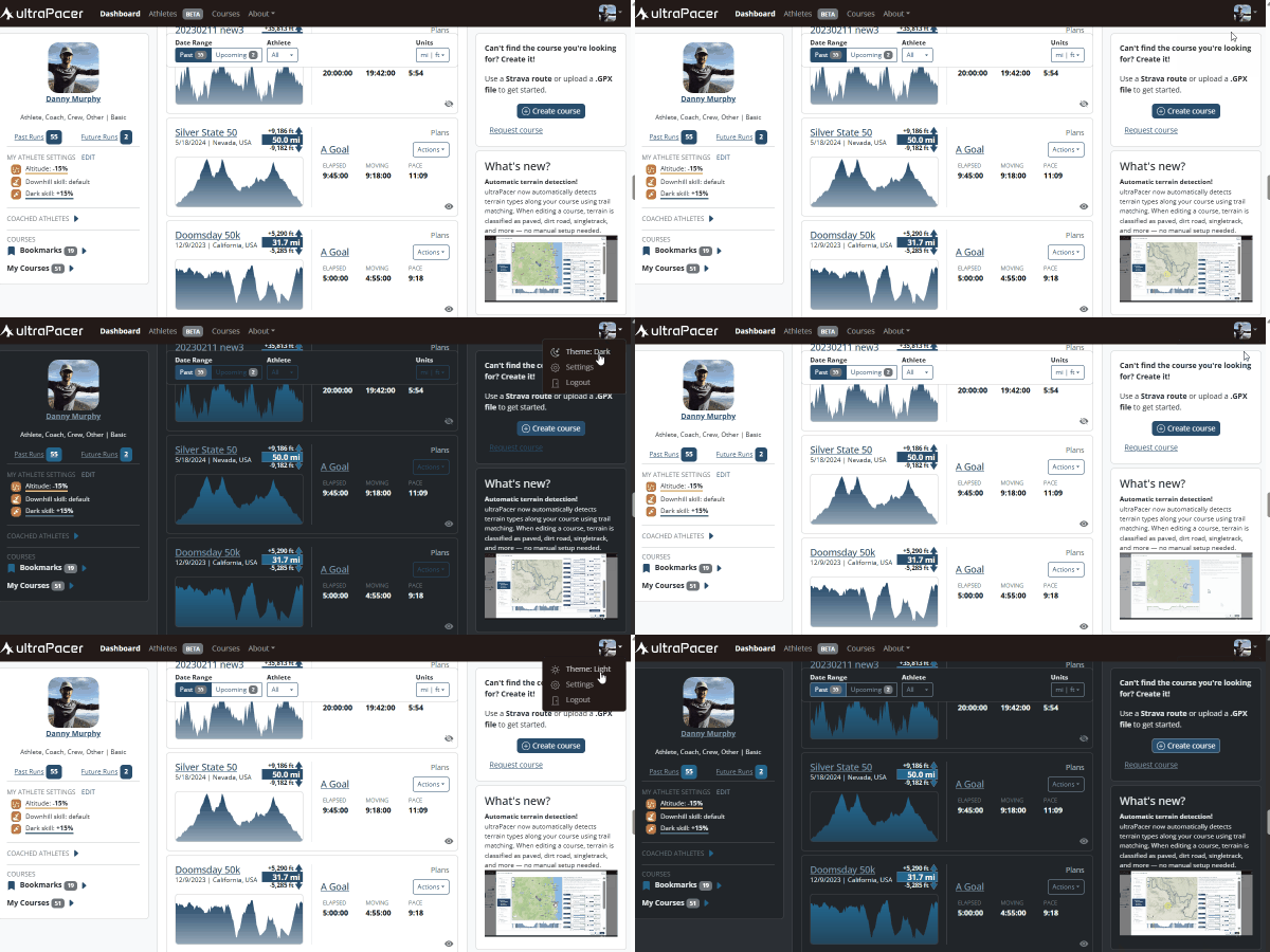
Dark mode is here!
ultraPacer now has a dark theme that’s easier on the eyes in low light. Tap the theme option in the menu to switch between light, dark, or auto — which follows your system setting.